Insight
Publications

Adobe Illustrator

St Kilda, Melbourne, Australia
Illustration

The Brief

The brief was to create visually striking  illustrations that would immediately feel local and recognisable to Melbourne-based students, while also appealing to international learners using the books to familiarise themselves with Australian culture and context.

The artwork needed to be:

  • Highly iconic and location-specific

  • Accessible and engaging for a diverse student audience

  • Flexible for print reproduction across various scales and formats

Forum Theatre

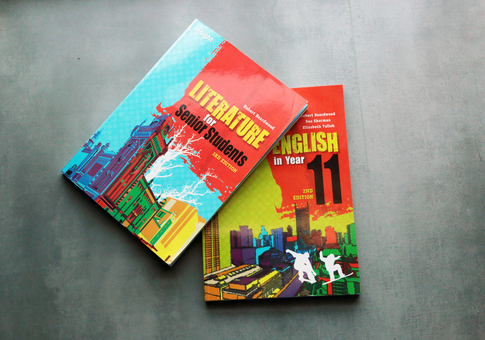
Rendered in a multi-layered, high-contrast colour style, the building’s Gothic Revival features are exaggerated in a stylised form, drawing attention to its rich architecture without being overly literal.

The left-to-right colour transition (cool tones to warm tones) reflects a subtle conceptual flow: past to present, tradition to modernity.

Clean vector lines give it clarity and structure, while the punchy palette injects youthful energy, fitting for an education setting.

South Bank

This illustration captures one of Melbourne’s most iconic and recognisable perspectives, looking toward the city from the Yarra River, showcasing landmarks like:

  • Flinders Street Station

  • St Paul’s Cathedral

  • Fed Square

  • Princes Bridge

  • The Arts Precinct

  • Eureka Tower

  • And Melbourne’s central business district in full colour

It rounds out the visual series by providing a narrative anchor point, a city view that locals immediately know and international audiences associate with Melbourne’s culture, architecture and vibrancy.

Bird's Eye

The bird’s-eye perspective gives it a slight sense of grandeur and orientation, situating the viewer in the middle of Melbourne’s urban complexity.

Colours move rhythmically across the image, sectioning zones and blocks.

Use of flat colour with no gradients or shading keeps the style clean and consistent with educational publishing requirements (easy print legibility, low ink use, high visibility).

Docklands

These illustrations were designed to bring Melbourne to life in a stylised but accessible way. They avoid excessive realism in favour of expression, bold shape language and clean reproduction in educational formats. As a set, they offer students a creative connection to place, support visual learning and elevate the overall experience of the textbooks.