
Adobe Illustrator, Photoshop, Indesign, WordPress
Logo Design
Pamphlet Design
Website Design
Creative Direction
Before this logo was developed, the Three2Six project lacked a visual identity that truly reflected who it was for and where it was based. The name alone, while meaningful in context (3PM to 6PM educational support hours), offered little to no visual or emotional connection to the communities it served.
There was no representation of Africa, no visual warmth, and no symbol that suggested inclusion, movement, or support for refugee children. The project needed a logo that told its story at a glance, one that could instantly resonate with parents, donors, teachers, and children alike.
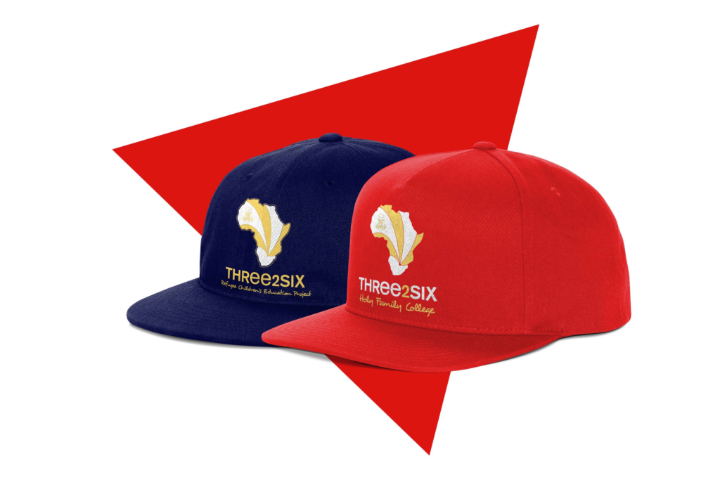
The logo is built around the shape of the African continent, symbolising the project’s inclusivity and outreach to refugee children from across Africa. The use of South Africa as the visual anchor point reflects the project’s location and operational heart.
The radiating ribbon-like shapes draw the eye inward to South Africa, a clear, central focal point that subtly suggests hope, safety, and unity flowing from across the continent.
These visual lines also hint at movement and journey, reflecting the displacement and migration many of the students have experienced.
The colour split reinforces the idea of diverse origins coming together in a shared educational journey.
Font Style:
A clean, geometric sans-serif for “THREE2SIX” paired with a more human, handwritten-style subheading. This contrast balances professionalism with the warm, child-focused mission of the program.
Colour Palette:
Balance: The Africa silhouette balances perfectly with the bold typographic treatment, making the logo readable and recognisable even at small sizes.
Icon Adaptability: The Africa motif is strong enough to be used as a standalone mark (e.g., in social icons, favicon, or embroidered on uniforms).
Highlighting South Africa: Positioning and colour naturally draw attention to the project’s physical location without the need for literal pinpointing.
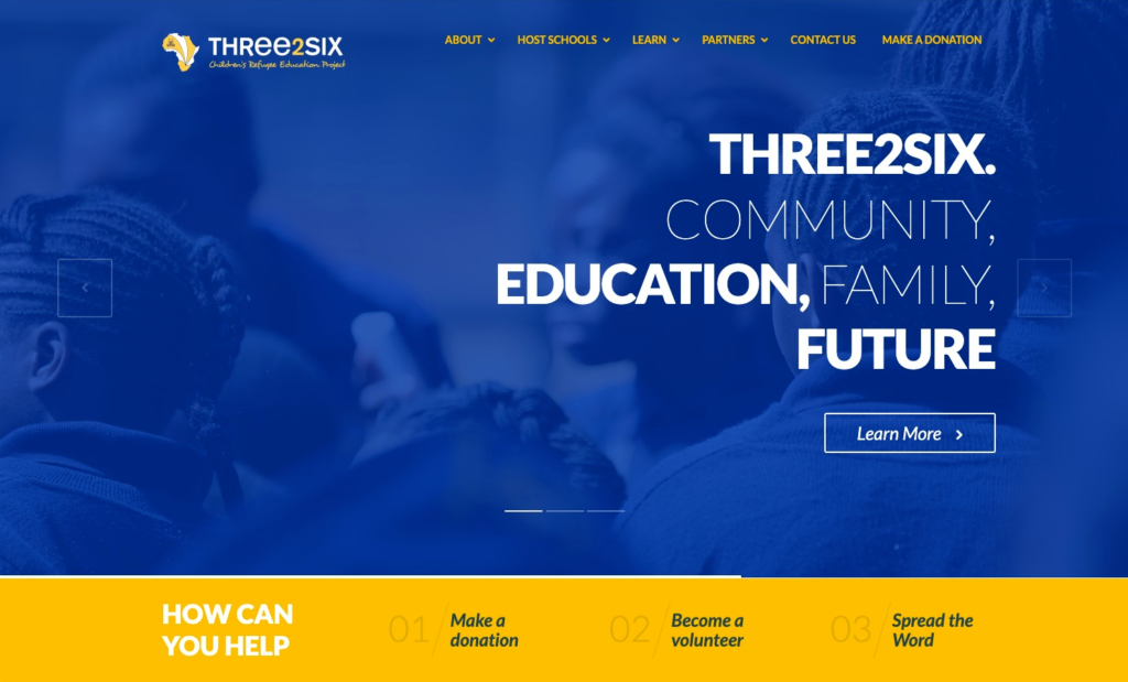
Instant clarity of purpose: The headline messaging is sharp, simple and values-driven. No scrolling required to understand what the organisation stands for.
Multiple user types accounted for:
Page structure supports skimmability: Large, high-contrast type and bite-sized copy blocks allow users to grasp meaning quickly, perfect for mobile and campaign traffic.
Emotive connection through photography: Background image of actual students adds credibility and trust. The subtle blur and overlay ensure the copy remains the focus without losing emotional texture.
Navigation consistency: Top menu matches the established brand while offering immediate access to key content areas (Host Schools, Learn, Partners, Contact, Donate)
This logo was created to visually represent a project that welcomes displaced children from across Africa, while honouring its roots in South Africa.
By merging symbolic geography with colour and contrast, the design communicates safety, structure, and inclusion, values central to the Three2Six project.
The combination of professional type and handwritten script captures both the educational purpose and the heart-led approach of the initiative.